
The FLOAAT Center
The Florida OCD Autism and Anxiety Treatment Center


Assessing the state of things.
Psychologist Cindi Gayle had a practice and a team of fellow practitioners and interns. She had a website, developed by a student as a pro bono project. The website included most of the relevant information and content, but the navigation was fractured, making the content difficult to find. There were many colors, photography and illustration styles, further adding to the difficulty in easily digesting the information.

Defining the goals of the business.
Cindi’s primary goal is to future-proof her practice and be able to scale it through franchising or selling the business in the future. Her current business (simply “Cindi Gayle”) wouldn’t serve that goal. In order to accomplish this, she first needed to separate her name and herself from the business. Luckily she had already started the hard work of developing a new brand. She had decided on the new name of the business: “The Florida OCD Autism and Anxiety Treatment Center'', or “The FLOAAT Center”.
Separate the Cindi Gayle name from the business to allow for future scaling
Develop a new identity and brand collateral to support the new business name
Meet patients where they are in a calm and inviting way
Be a welcoming environment for diverse groups of people and minorities

Creating a full, robust vision.
Cindi loved a quote by Bruce Lee that talked about being formless and shapeless like water. Luckily I agreed that it was a great metaphor for a treatment center focused on helping people let go of and overcome their anxieties. Leaning into a water theme felt like a given, but there was still a lot to figure out how to execute.
As a woman and person of color, it was also very important to Cindi to infuse diversity and inclusion in her practice. She wanted it to be immediately obvious that everyone is welcome as they are. Their services help people live a life according to their values. We incorporated language throughout the site that speaks to these values. We also included options such as a ‘preferred’ name box and preferred pronouns on the intake form.
Developing a new brand.
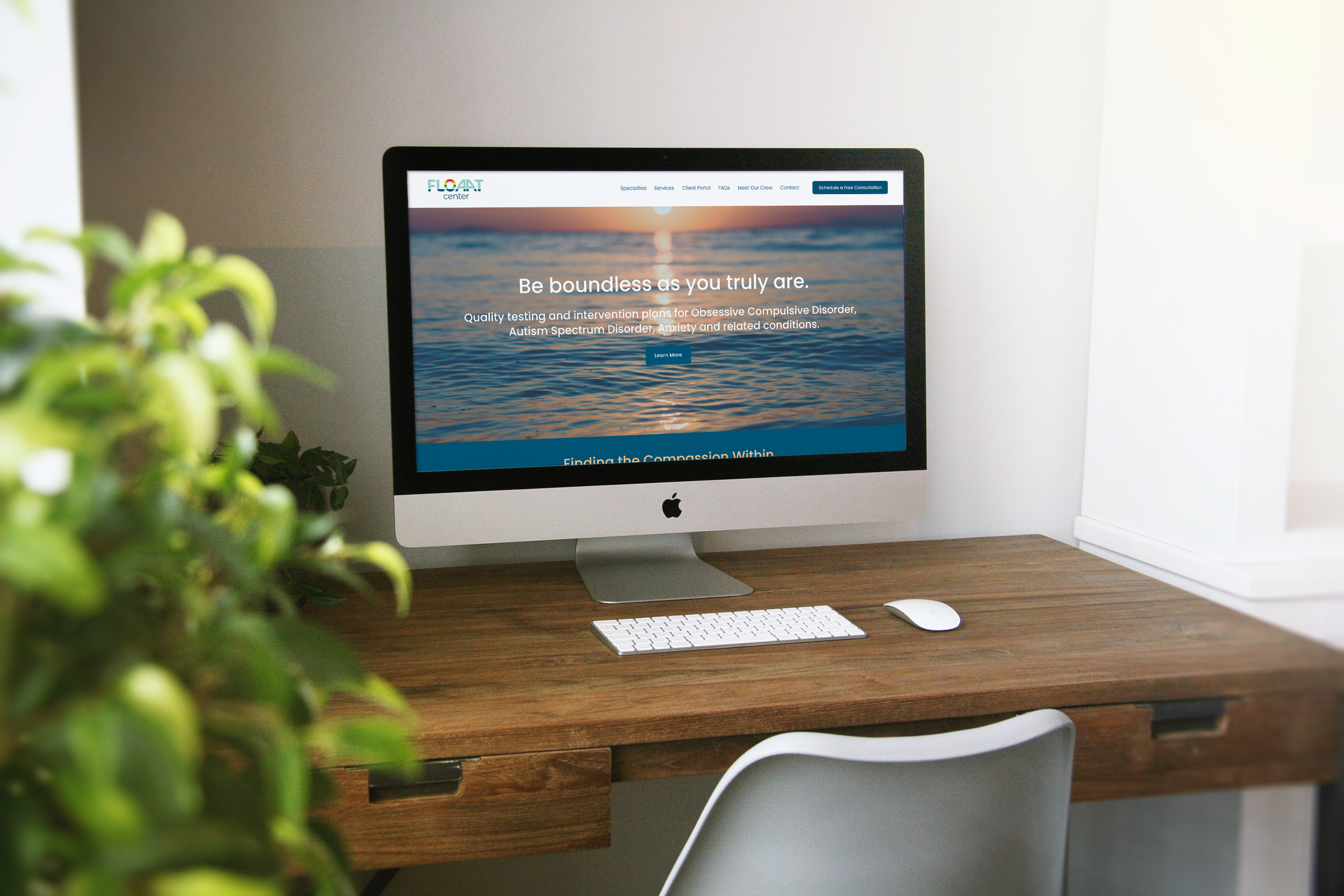
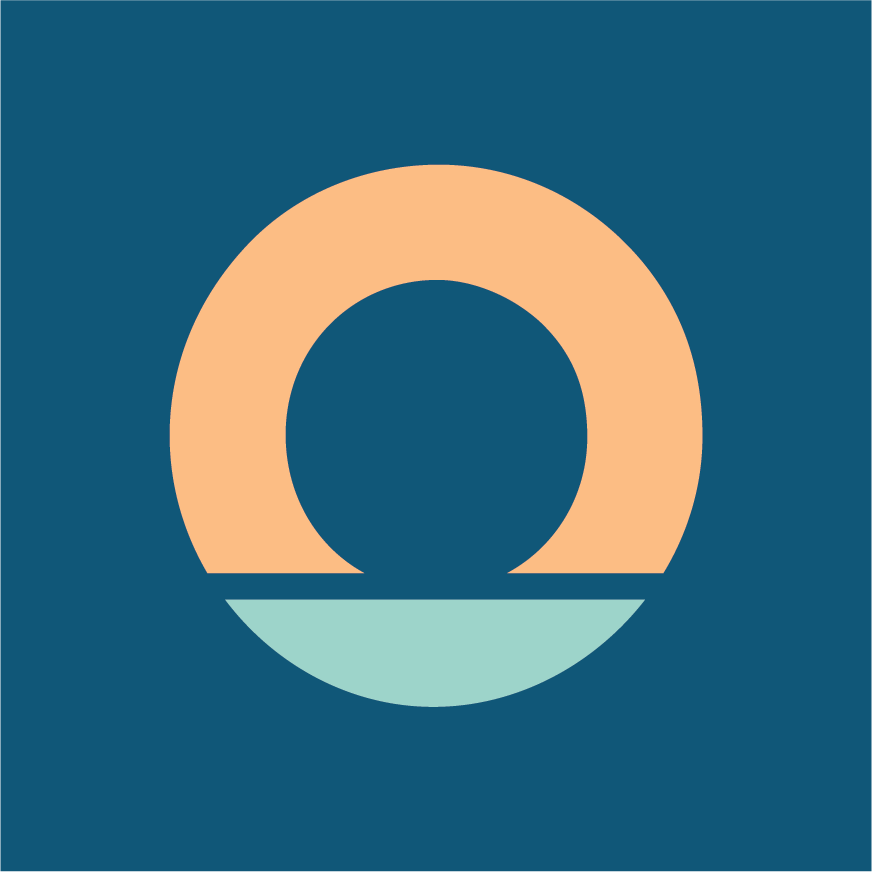
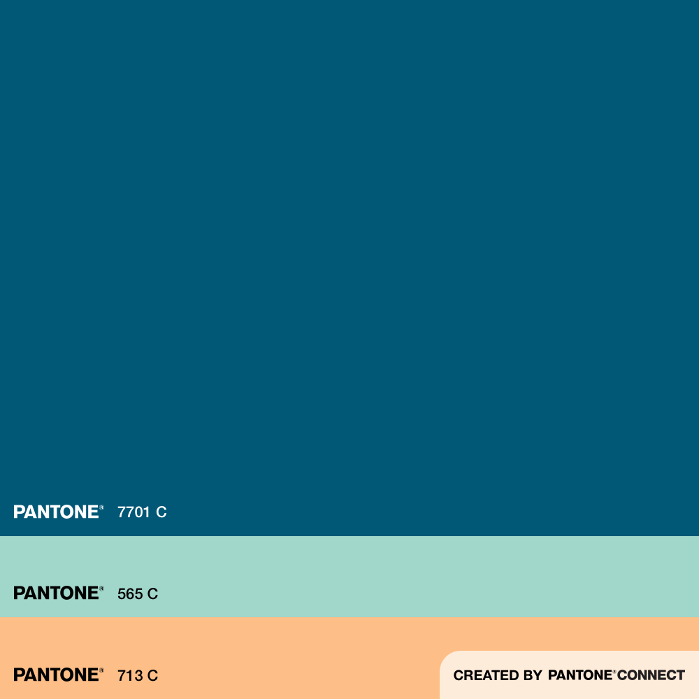
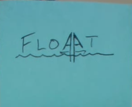
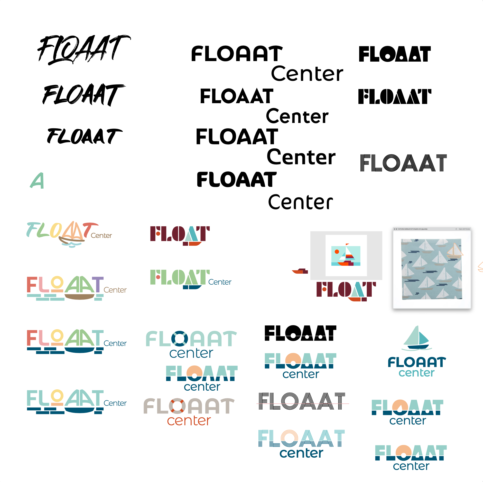
Cindi was an enthusiastic participant in developing the new brand. She had already developed the new name and had brainstormed ideas for a new logo, including a sailboat theme. Luckily she was also along for the journey of the process. I worked through multiple executions of the sailboat theme as well as other water-related ideas. We also tested different color palettes. We ultimately landed on a palette of blues and orange, reminiscent of water and sun, and evoking both calmness and hope. The color breakdowns were codified as brand standards and the new logo was versioned into usable assets for different applications.
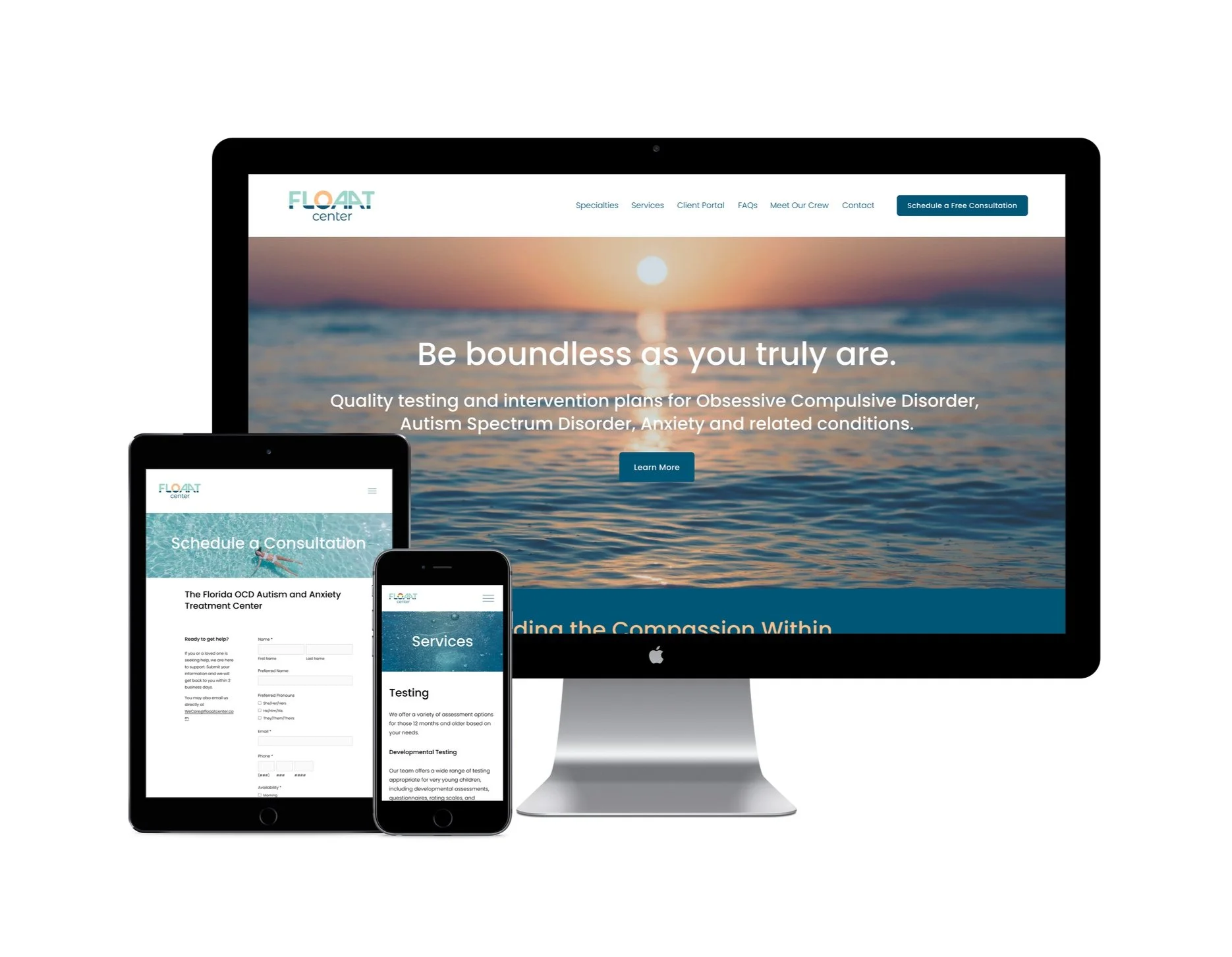
We always kept in mind the patients’ needs of having a calm, clean environment to get vital information. Other considerations included legibility and reproducibility at scale, understanding that this brand would first be seen online on the website and social media, but would also live in small print on business cards and other collateral as well as large print in signage.
Another matter would be to create a cohesive look and feel with photography and illustrations. It was important to strike the right tone when dealing with anxiety issues—do you show a person in distress that needs the services provided, or a serene person already cured? Do you welcome or alienate certain patients if they do or don’t see themselves in the chosen images? Do you make the areas of specialty more or less abstract by using illustrations? The existing site used a fragmented mix of photography and illustrations from different sources, with the effect of neither portraying distress or serenity, just disjointedness. Knowing there would likely never be a dedicated photoshoot for the website, I ultimately opted to use less photography with models and lean more into the metaphor of floating in water. Minimal, clean illustrations were employed on the homepage that furthered the water theme.


Getting organized.
I’ve found that oftentimes clients lack a good foundation. They’ve taken the brave but often messy steps of getting their business off the ground. In order to scale beyond a small startup, they need organization and tools in place. I thrive on developing information architecture to support the needs of the business.
Cindi had the content and I helped her bring it all into one location (Google Drive) following the same folder structure as the site navigation. These documents became the ‘source of truth’ where all the editing and refining took place before the content was added to the new site.

Getting down to it.
Cindi’s existing site was developed using Wordpress, but was difficult, if not impossible, for her to manage and update herself. Squarespace was a better option for creating consistency across the site that would be easy to maintain and approachable for any of her crew to update.
There were many logistical considerations to take care of behind the scenes:
Securing a new domain
Setting up customized email, forwarding, and user accounts for her entire staff
Updating information on Google business listings
Redirecting (and eventually shutting down) the existing site to the new site
Optimizing SEO on each page and asset

Critique, Review, Refine.
We enlisted copywriter and content specialist Chan Tran to help refine the voice of the brand and consult on the structure of the site. Through individual and group review sessions, the brand was coming together. Cindi remarked that she liked to just look at it because it was so pretty and really brought her vision to life.
Putting it out into the world.
Launch day (or days) can be nerve-wracking for everyone. There are many parts and pieces involved and even with a lot of preparation the unexpected can happen and it requires nerves and patience. Luckily this launch went smoothly and I monitored all the connections, redirects, and site mapping to make sure the new site was settling in properly.
A little extra frosting.
To stay true to Cindi’s vision of inclusivity, I knew she would appreciate a version of the FLOAAT logo in support of Pride, which I provided as a surprise at the end of May in time for Pride month. The logo was switched out for the month of June on the main website as well as social media.

Following through.
As stated in Cindi’s original goals, she wanted the ability to maintain some of the content on the website. I provided training sessions to help her understand what is easily managed and how to do it. I also refined some design elements with updateability in mind.
Cindi’s team has been able to carry the new brand forward with small website updates. They have especially brought the brand to life on social media, easily putting the brand colors and logos to use.