Brand Identity • The FLOAAT Center
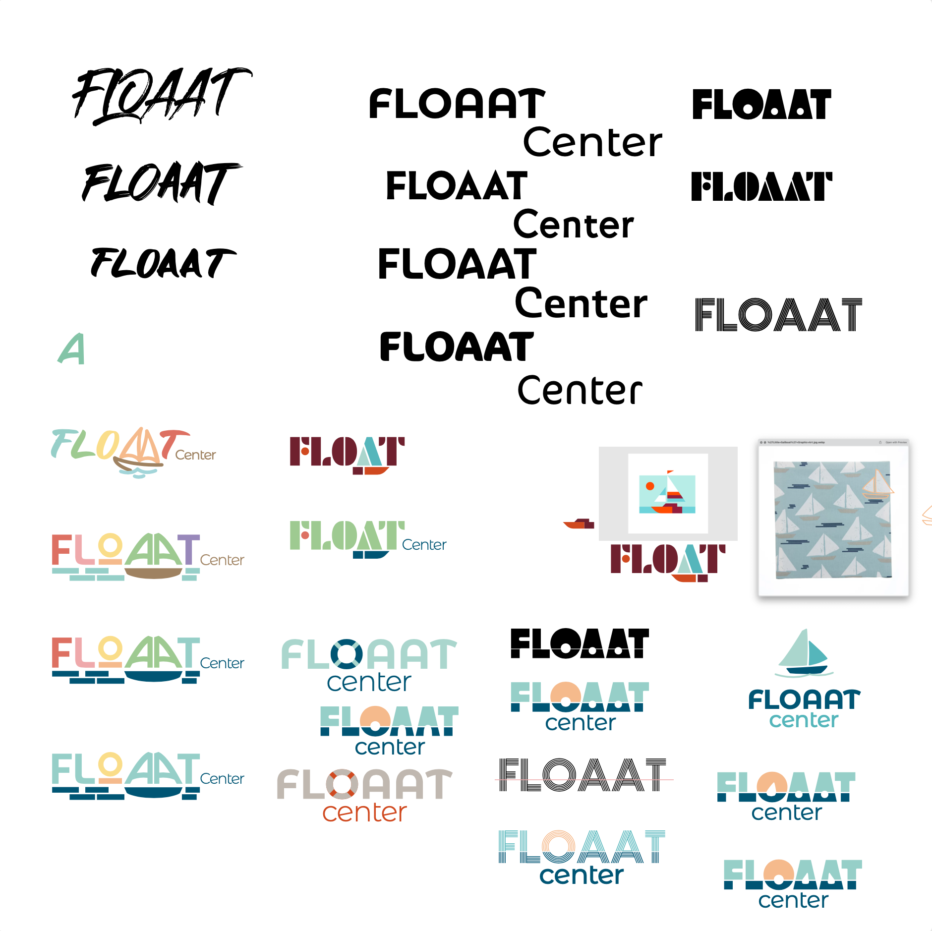
The client was an enthusiastic participant in developing the new brand. She had already developed the new name and had brainstormed ideas for a new logo, including a sailboat theme. I worked through multiple executions of the sailboat theme as well as other water-related ideas. We also tested different color palettes. We ultimately landed on a palette of blues and orange, reminiscent of water and sun, and evoking both calmness and hope. The color breakdowns were codified as brand standards and the new logo was versioned into usable assets for different applications.
We always kept in mind the patients’ needs of having a calm, clean environment to get vital information. Other considerations included legibility and reproducibility at scale, understanding that this brand would first be seen online on the website and social media, but would also live in small print on business cards and other collateral as well as large print in signage.
To stay true to the client’s vision of inclusivity, I knew she would appreciate a version of the FLOAAT logo in support of Pride, which I provided as a surprise at the end of May in time for Pride month. The logo was switched out for the month of June on the main website as well as social media.


